

Type
Tools
Timeline
Engineering Confidence.
Dismantling Size Anxiety.
How a proprietary Dual Height-Tier sizing model reduced return rates by 28% and how brand ambassadors concept increased sales.
At a Glance
Three numbers that prove the design worked.
Before I explain how, here's what changed after shipping the redesign. These aren't vanity metrics. Each one maps directly to a design decision I made.
28%
Reduction in return rates, the core business goal
45%
Surge in community interaction via Ambassador program
8.9/10
Fit-certainty score, up from 4.2 in usability testing
The Problem
It wasn't a sizing problem.
It was a trust problem.
Recens sells 100% polyester-free western wear to conscious indian consumers. Our sustainability mission depended on low return rates, every returned parcel has a carbon footprint. But we had a hidden leak.
Users were abandoning carts. Not because they didn't want the product. Because they didn't trust that it would fit.
The standard industry response is "just add a size chart." We had one. It wasn't working. So before touching the UI, I needed to understand why.
Problem Statement
How might we give users virtual fit confidence, without adding friction to the checkout journey, in a way that directly reduces the environmental cost of returns?
Research
40 interviews. One surprising insight.
I ran 40+ qualitative interviews with users across different body types, heights, and shopping habits. I wasn't just asking "what's wrong with sizing?" I was mapping the emotional arc from discovery to return.
I expected to hear about waist measurements. Instead, I kept hearing about height.
The real insight: users weren't just Small or Large, they were "Short-Small" or "Tall-Medium." Standard charts only measured width. They completely ignored the vertical dimension of fit.
"I'm 5'8", and I usually have to buy a Large just for the length, even though my waist is a Small. It ends up looking like a tent on me."
Design pivot this triggered
Creation of the Dual Height-Tier System, separating Under 5'6" from 5'6"+ to ensure vertical proportionality.
"I've been burned by 'cotton blends' that feel like plastic. If I can't feel the fabric, I'm hesitant to pay a premium price."
Design pivot this triggered
Story-Driven Specs: replacing dry material labels with tactile language like "100% Cotton" and "CARE FOR ME FOREVER" copy to close the fabric trust gap
"I don't want to answer ten questions about my body shape just to find a size. I just want to know if the dress will fit my height."
Design pivot this triggered
Rejection of Option C (Sizing Quiz) entirely. Users wanted instant answers, not a diagnostic tool at the point of purchase.
Design Process
Three paths. One winner. Here's how I chose.
Good design decisions aren't gut feelings, they're testable hypotheses. I framed each option as a hypothesis and stress-tested it against what I'd heard in research.
| Option | Hypothesis | Research Signal | Status |
|---|---|---|---|
| A) Static Chart | Standard charts provide lowest friction but fail to address vertical proportionality, leading to high returns. | Already failing. Users confirmed this was the source of 80% of fit-related returns. | Control |
| B) Dual Height-Tier | Splitting sizes by height tier (Under / Over 5'6") reduces fit anxiety with minimal clicks, targeting a 20%+ drop in returns. | Directly addressed the "Vertical Gap" insight from interviews. Minimum clicks = minimum friction. | Winner |
| C) Sizing Quiz | A multi-step quiz offers highest accuracy but creates a friction barrier that decreases checkout conversion by 10–15%. | Users explicitly said they didn't want to "answer ten questions." Tool Fatigue risk was too high. | Rejected |
The trade-off I made consciously
Option C would have been more technically impressive. But it solved a problem users didn't have (accuracy) by creating a problem they explicitly told me they hated (friction). Option B was the right call, not the flashiest one.
How it evolved through two real iterations
Neither version came out fully formed. Here's the honest iteration arc:
Iteration 01
The Digital Sizing Calculator
My first instinct was a sizing quiz, ask users a series of questions, return a personalized recommendation. Technically elegant. Users hated it.
Feedback: "I just want to know if it fits. Why is this so complicated?" Users felt like they were doing homework before shopping.
Iteration 02
The Dual Height-Tier Chart
I stripped the quiz entirely. Instead of asking users questions, I gave them a single binary choice: your height range. Under 5'6" or 5'6"+. One click. Instant clarity.
The design challenge was keeping the table scannable, not letting it feel like a "dense spreadsheet." I used visual hierarchy and tight copy to make each cell feel like a direct answer, not a data point.
The Solution
Three interlocking design decisions.
The final product wasn't one big feature, it was three smaller decisions that reinforced each other. Remove any one of them and the system breaks.
📐
Dual Height-Tier Sizing
XS–XL split across two height bands (Under 5'6" and 5'6"+). Users filter by height first, then width, aligning silhouette before they see a single measurement.
✍️
Story-Driven Technical Specs
As a Co-founder of Recens, I recognized that transparency is our most effective sales tool. When a user can mentally 'feel' the fabric through the Composition and visualize the scale via the Model Information, the 'Trust Gap' disappears. We aren't just selling clothes; we are engineering a sense of physical security in a digital space.
🤝
Ambassador Program Flow
"Spread the Recens love, earn a commission on every dress you sell." A commission-based program nested in the footer, accessible to power users, invisible to casual shoppers.
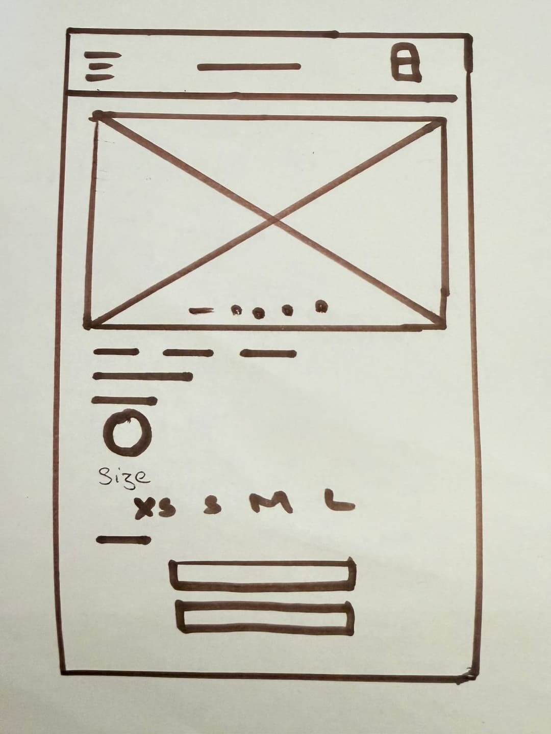
Initial wireframe of product page
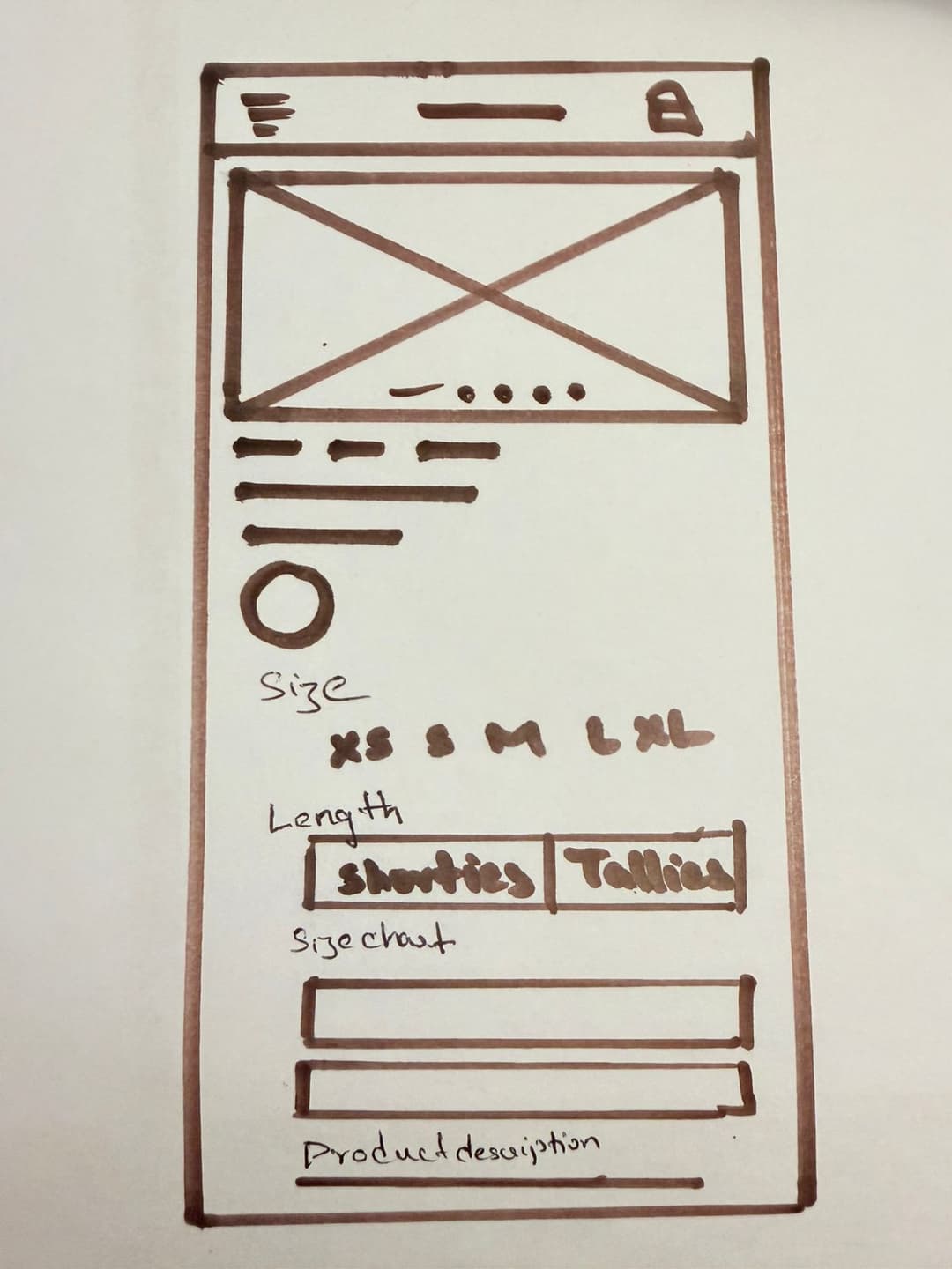
Wireframe of product page after research
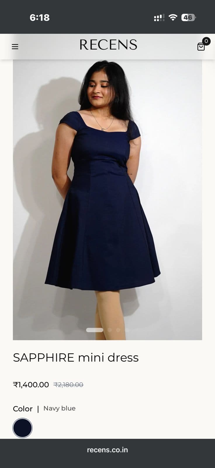
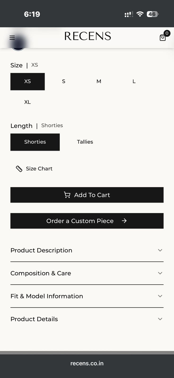
Final Hi‑Fi prototypes of product page
Impact
What actually changed.
The usability study used a within-subjects design with counterbalancing to mitigate learning effects. Users tested Version A (static chart) and Version B (dual-tier) in randomized order.
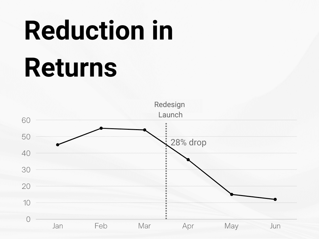
The 28% return reduction wasn't just a business win, it was the sustainability mission made measurable. Every return avoided is packaging saved, a delivery truck trip removed from the equation.
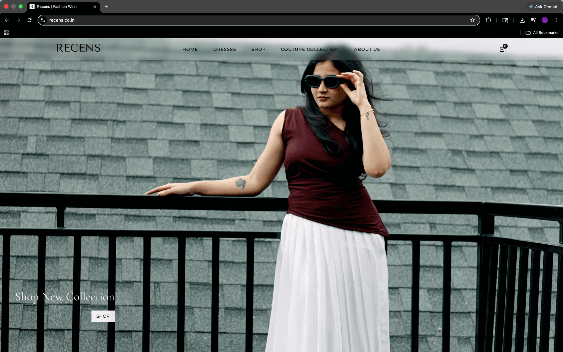
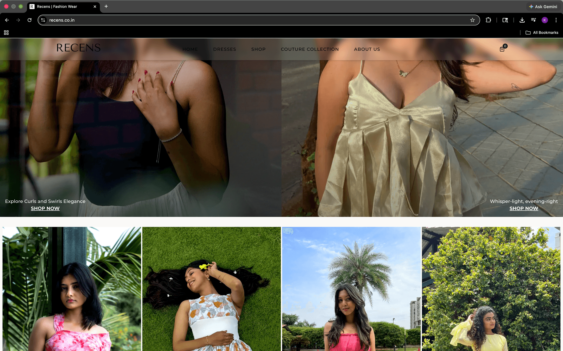
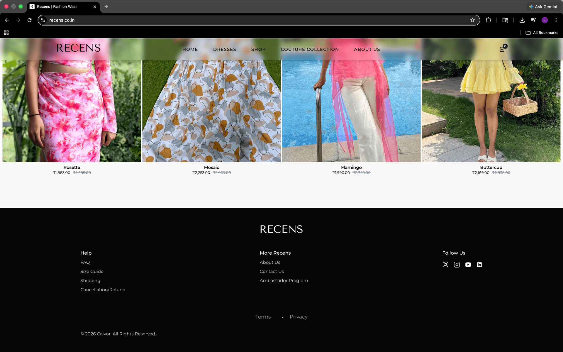
The website features a glassmorphic header and a redesigned footer for streamlined access to key information, leveraging modern UI layouts to deliver a high-end aesthetic with intuitive usability
Reflection
What I'd do differently, and what's next.
What I learned
The most important design decision I made on this project wasn't the UI. It was choosing to reject Option C. The pressure to build the more technically impressive solution is real, especially as a founder trying to prove competence. But the interviews were clear, and I trusted them over my own instinct to over-engineer.
I also learned that UX is inseparable from business strategy. Every pixel I changed served a measurable goal. That's the kind of designer I want to be at scale.
Strategic Pragmatism: The skill only a Designer-Founder develops
What I might build next
01
AR Fabric Viewer
Let users see the weave and texture of 100% cotton at zoom, closing the tactile trust gap that copy alone can't fully bridge.
02
Camera-to-Size Mapping
AI-driven body measurement via phone camera, the logical next step from the dual-tier model to true personalized fit confidence.
03
Ambassador Analytics Dashboard
Give ambassadors visibility into their community impact, conversion data, social reach, commission trends, to deepen the retention loop.