Case study · Envox Media
From Dead Ends to a Conversion Engine.
How a mobile-first redesign eliminated "Tech Overwhelm," built instant credibility, and drove a 40% surge in engagement for Envox Media.
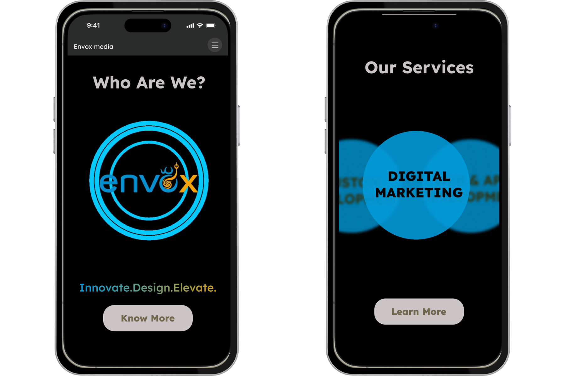
The problem
A "bland" site was actively losing high-value leads.
Envox Media had real capability. The website didn't reflect it. High-value leads, time-constrained entrepreneurs, were bouncing before ever reaching the agency's strongest work.
This wasn't a visual polish problem. It was a trust architecture problem. The risk wasn't just aesthetic. Every "dead end" in the navigation was a missed contract.
Tech Overwhelm
A fragmented 8-item menu created decision paralysis for mobile users already context-switching on the go.
Dead Ends
No "next step" after viewing work. Users who wanted to explore further had nowhere to go, and bounced.
Trust Gap
Social proof (testimonials) lived on a separate page. By the time users found it, they'd already lost confidence.
How Might We
Two personas. A genuine tension between their needs.
Stakeholder interviews surfaced two primary archetypes. Their requirements pulled in opposite directions; the design challenge was resolving that tension, not picking a side.
Her UX requirement
The "Wow" Factor
She needs to see high-fidelity animations and a sleek mobile flow to believe Envox is modern enough for her brand.
His UX requirement
The "Two-Tap" IA & Social Proof
He needs simplified navigation to find the Services page instantly, and a Testimonial section to bridge his trust gap.
Note
Three questions I couldn't answer yet, and how I worked through them.
This is the phase most portfolios skip. Before touching Figma, I sat with three design questions that didn't have obvious answers. Working through each one shaped every downstream decision.
How might we deliver a high-energy "wow" factor without triggering "tech overwhelm"?
We achieved this by prioritizing purposeful motion. Instead of decorative clutter, I used performance-optimized animations to guide the user's eye toward key information, ensuring the visuals acted as a bridge to engagement rather than a barrier.
Why did the design pivot from a feature-rich desktop layout to a streamlined, single-column flow?
The original brief implied desktop-first. I almost built it. Then stakeholder interviews with the CEO and Analytics team changed everything, the majority of potential clients were accessing the site via mobile devices while on the go. A feature-rich desktop layout would have been technically impressive and functionally wrong for the actual audience.
How did you restructure the IA to balance visual flair with technical efficiency?
The competitor audit of 5 rival agencies revealed a consistent market pattern: agencies chose between being memorable or being usable. The memorable ones had chaotic navigation. The usable ones were forgettable. This gap set the design constraint precisely, Envox needed to own the overlap.
Two data sources. Each one changed the direction of the design.
The "why": stakeholder data
The Mobile-First Pivot
Through interviews with the CEO and Analytics team, I identified that the primary users were entrepreneurs accessing the site via mobile devices while on the go. This single data point invalidated the existing desktop-first layout and forced a complete rethink.
Competitive lens: 5-agency audit
The Memorability Gap
My competitor audit showed that rivals were too simple to be memorable, or too visually complex to convert. Envox needed a bold identity that didn't sacrifice usability. Every rival had chosen one or the other. That gap was the strategic opening: high-fidelity aesthetics paired with radical functional simplicity. Not a middle ground, both at once.
Note
Information architecture
Rebuilding the system from three failure points up.
Each structural problem required its own fix. I didn't redesign the site, I redesigned the logic underneath it.
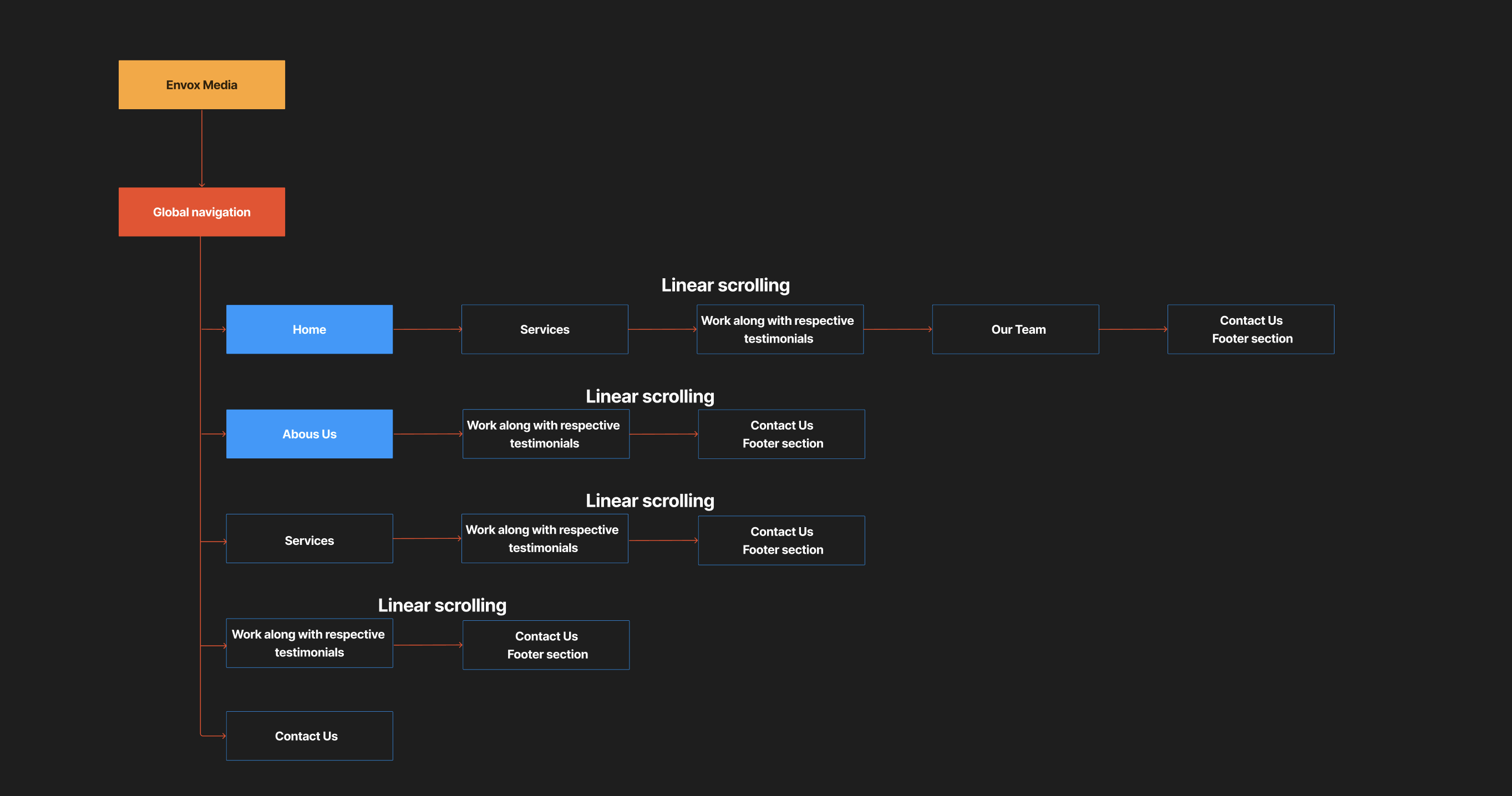
Navigation: 8 items → 5 pillars
I condensed the fragmented 8-menu hierarchy into a single, intuitive hamburger menu with 5 core pillars: Home, About, Services, Work, Contact. Strategic consolidation to ensure a "two-tap" journey to any destination, satisfying Deep's efficiency requirement without sacrificing Advaita's clean mobile experience.
Wireframes
Lo-fi to Hi-fi, the structural logic made visible.
Wireframes were used to test the IA before committing to visual design. The goal was to validate the two-tap journey and the Conversational Loop before aesthetics entered the picture.
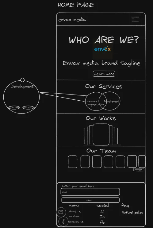
Home Page
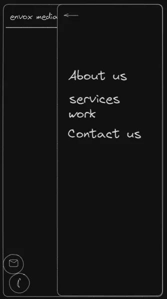
Navigation Menu
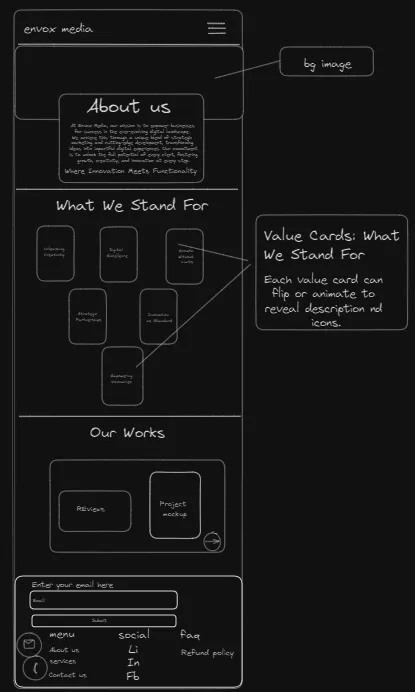
About Us
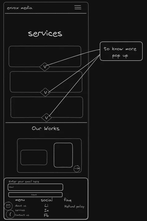
Our Services
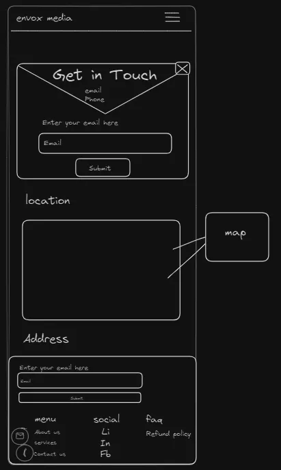
Contact Us
Note
The solution
Navigation
The Mobile Command Center
I condensed a fragmented 8-menu hierarchy into a single, intuitive Hamburger Menu to minimize interaction cost for users on the move.
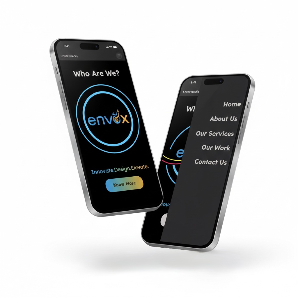
Placement
Solving for the "Trust Gap"
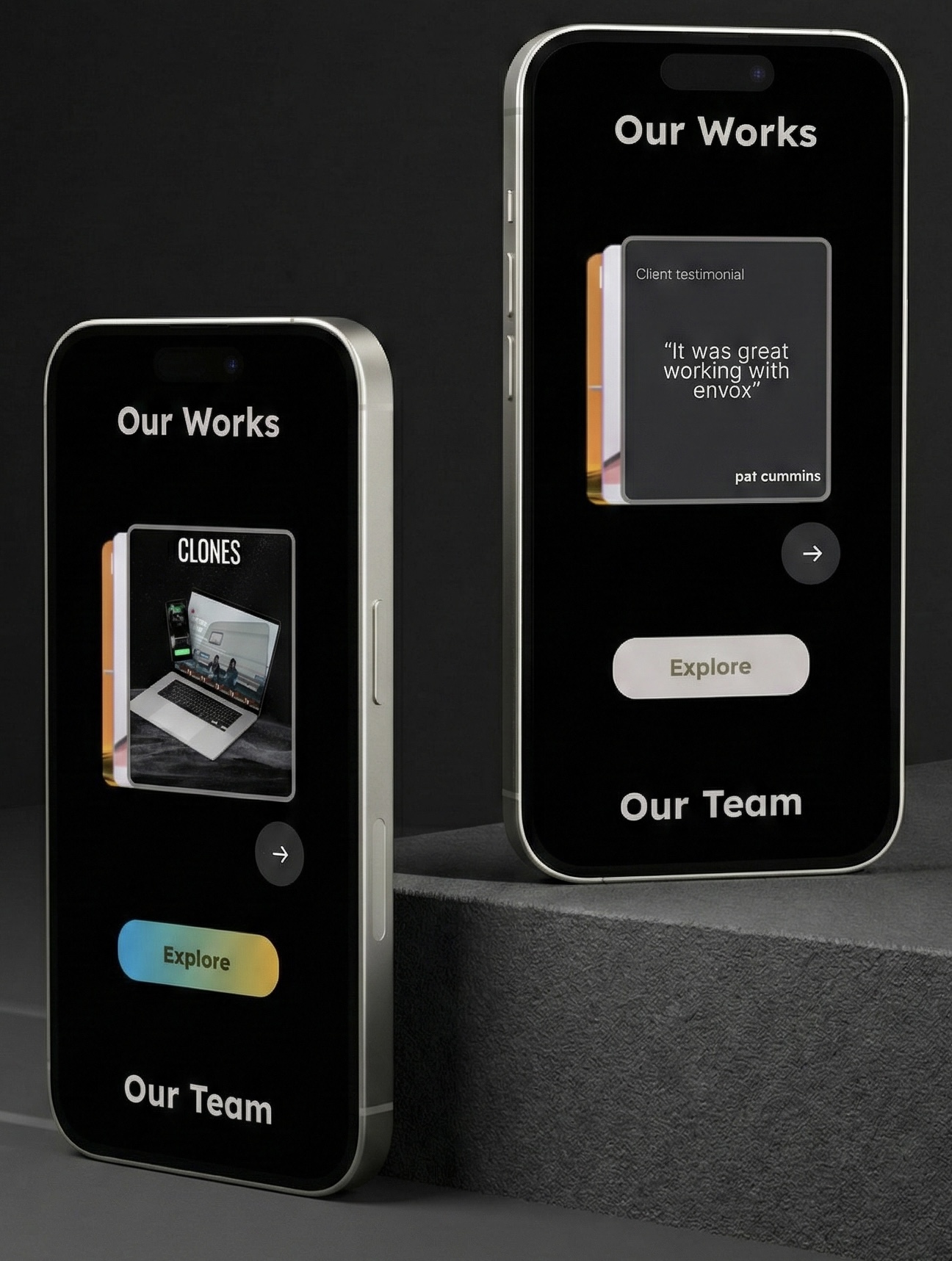
To solve the "Trust Gap" for users like Deep, I engineered a UI pattern that presents evidence exactly where it matters most, alongside the work.
Layered Validation
Client testimonials play directly on top of work images with a timed delay.
Frictionless Context
By merging proof and output into a single Snippet, I eliminated the need for users to navigate away to a separate testimonials page.
The Loop
Each snippet concludes with an "Explore" CTA, proactively guiding the user into the next phase of the brand narrative without hitting a dead end.
Three outcomes. Each traced to a design decision.
The redesign moved the metrics that matter for a B2B agency. I don't report numbers without tracing them to the decision that produced them.
40%
Surge in user engagement. Attributed to the Conversational Loop, users who previously hit dead ends now complete the full brand narrative through to Contact.
8→5
Navigation items consolidated. Eliminated decision paralysis. Deep reaches Services in 2 taps. Advaita gets a clean, uncluttered mobile entry point.
0
Dead ends in the user journey. Every page exits into the next phase. The site now functions as an active lead-nurturing sequence.
Note
Reflection
What I learned. What I'd do differently..
What I Learned
The most important skill this project built wasn't visual, it was diagnostic. I had to resist the instinct to start in Figma and instead map the system failure first. The three root causes (navigation overload, displaced proof, dead-end pages) would have been invisible to a designer who opened Figma on day one.
I also learned that stakeholder data is a design constraint, not background context. The CEO's mobile analytics were the single most important input on this project. Without them, I might have built a technically impressive desktop experience for an audience that accesses the site entirely on mobile.
"I bridge the gap between HCI research and technical development, delivering products that hit business goals and user needs simultaneously."
SYSTEMS THINKING + STAKEHOLDER INTEGRATION